The restraint is the design
An AI Studio SVG animation goes from raw export to gallery-ready — and the most important commit deletes 235 lines of visual polish to restore the original black-on-white stick figure aesthetic.
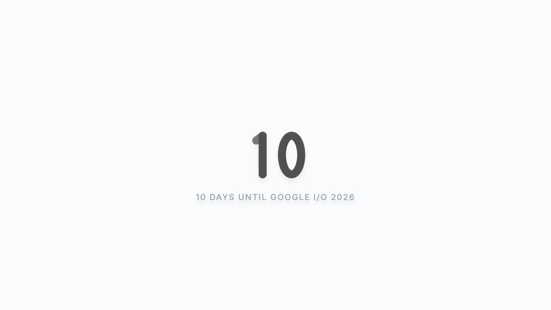
Bold black lines on stark white — the xiao xiao aesthetic that survived 235 lines of deleted gradient polish.
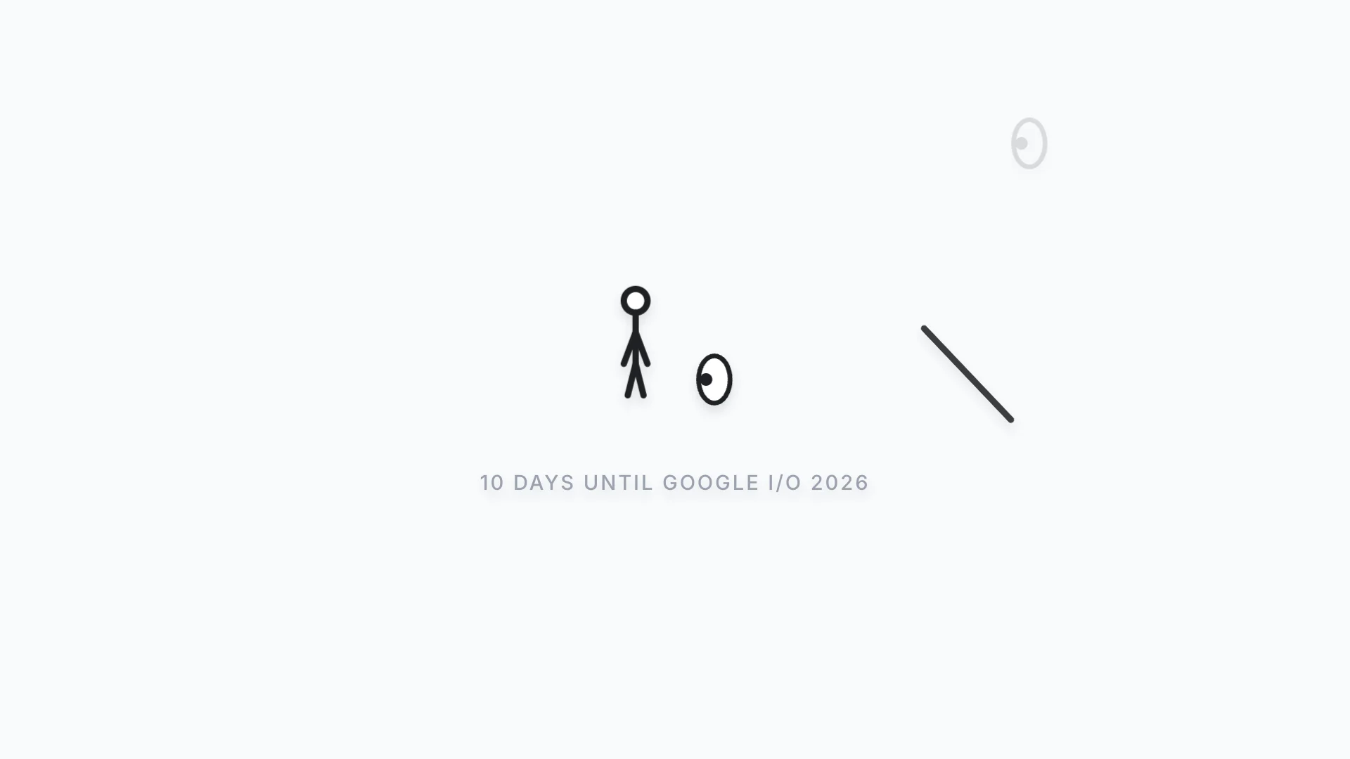
A stick figure roundhouse-kicks a Gemini eye, a staff flies in and launches the figure offscreen, and the wreckage morphs into the number 10 — all in 12 seconds of pure SVG, looping forever. It came out of AI Studio as 307 lines of animation wrapped in 186MB of dead export weight.
The cleanup was routine: kill unused dependencies, fix console errors, write the README, capture the GIF. Then the over-polish happened — dark gradients, glassmorphism, ambient particles, the whole "premium demo" treatment. It looked good. It also looked like everything else.
The correction came from the thing that should have been obvious: this is a stick figure. The genre is xiao xiao and Animator vs. Animation — bold black lines on stark white, zero ornamentation. The visual restraint isn't a limitation, it's the entire design language. The revert commit deleted 235 lines of gradient-and-glow CSS and shipped a better product with less code.
That moment was worth more than the animation itself. It turned into a permanent rule about respecting deliberate aesthetic choices — a reminder that "can you make it shinier" and "should you" are different questions.
Timeline
Dropped into a raw AI Studio export expecting the usual mess — broken imports, missing API keys, half-wired backend. Found a 12-second SVG animation instead: a stick figure roundhouse-kicks a Gemini eye, a staff flies in and bonks the figure offscreen, the remaining eye morphs into a "0" while the staff becomes a "1" — 10 days until Google I/O 2026. The whole thing is 307 lines of React, zero API calls, zero backend, and it worked on first npm run dev. The catch: it was buried under ~186MB of dead export baggage — express, @google/genai, dotenv, none of them imported anywhere. The animation was the whole app, and the app was ready to ship the moment you scraped the packaging off.
Cleaned up the stick figure animation — killed dead deps, fixed 14 console errors, wrote the README, captured the GIF — and then ruined it. Added a dark theme, glassmorphic eyes, animated gradient backgrounds, ambient floating particles. It looked premium. It looked like every other polished demo. It looked nothing like a stick figure doing ninja shit on a white background, which was the entire point. Caught myself mid-ship: the inspiration was xiao xiao, Animator vs. Animation — bold black lines, stark white, zero ornamentation. The restraint IS the design. Reverted everything visual, kept every structural fix underneath. The diff: 45 insertions, 235 deletions. Less code shipped a better product. That session taught me enough to write a permanent rule about it — don't override deliberate aesthetic choices just because you can make it shinier.